Designing for Clarity During Crisis
Prevented 50K+ Redundant Messages and Cut $150K in Costs
Miro
PowerBI
AzureDevOps
1 Stakeholder
2 Engineers
1 Product Manager
Prototyping
Interaction Design
User Research
Data Visualization
Business Problem
Storms triggered over 10 million outage-related texts, but internal teams lacked visibility into:
- What was being sent
- To which customers
- At what time
This led to confusion, redundant messages, misaligned decisions, and customer frustration, especially during high-pressure storm events.
Our Goal
Align teams around real-time, trustworthy data during critical storm events
The ask began as a visual refresh, but deeper research revealed that misalignment and lack of trust in the data were the true barriers to effective communication.
We set out to:
- Create a centralized dashboard tailored for high-pressure storm coordination
- Ensure teams could see the same data at the same time, without second-guessing it
- Help stakeholders act quickly, without sending duplicate or conflicting messages
- Support better customer experience by reducing confusion and message fatigue
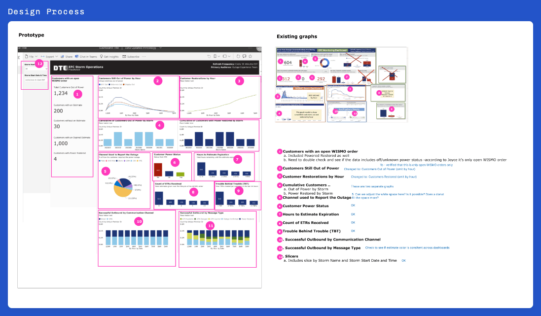
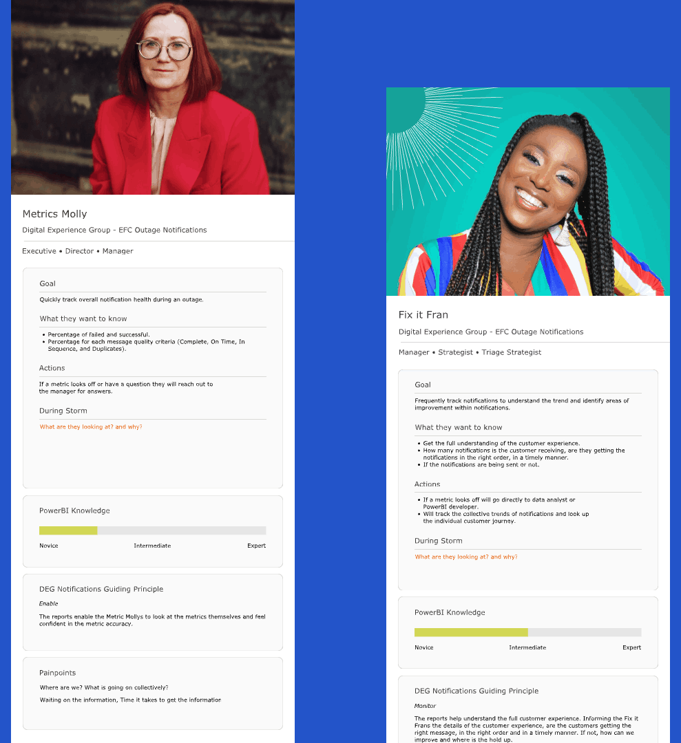
Key Personas & Core Pain Points
Responsible for monitoring message strategy and preventing overlap.
- Needed real-time clarity on what was sent and why
- No centralized, storm-specific dashboard
- Struggled with inconsistent data from overlapping reports
Focused on reducing confusion and message fatigue.
- Couldn’t tell when customers were being over-communicated
- Lacked insight into restoration timelines by region
- Couldn’t track message cadence by audience
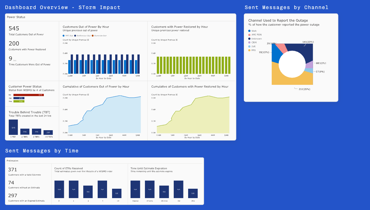
The Solution
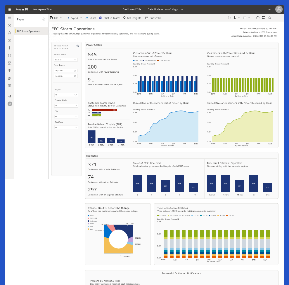
A Role-Based Storm Mode Dashboard for real-time coordination with clarity and control during major outage events.
Key Features
- Dashboard Overview: Real-time snapshot of storm impact
- Audience Message Log: Sent messages by time, channel, and segment
- Overlap Insights: Highlighted duplicate efforts in real time
- Restoration & Duration Tracker: Operational timelines
Where It Created Value
- Centralized view aligned all teams in real time
- Removed guesswork around communications strategy
- Prioritized the right data for the right roles during emergencies
- Prevented customer confusion and reduced message fatigue
Results & Feedback
- 50K+ redundant messages prevented during one major storm
- $150K+ annual savings in SMS costs and operational inefficiencies
- Improved trust in data and cross-team coordination
- Faster, more confident decision-making under pressure
Design Insight
Even in high-stakes, fast-paced environments, thoughtful UX can drive measurable impact.
User Insight
Teams reported feeling more aligned, with a clearer understanding of what was being sent, to whom, and when.
What I learned
- Designing for urgency requires clarity, confidence, and simplicity, especially in high-stress environments
- A clear visual hierarchy helps teams focus and act quickly when it matters most
- Close collaboration with data engineers built trust in the metrics and ensured accuracy
- Testing the dashboard during real storm events made the design more actionable and resilient under pressure
Working within Power BI’s constraints pushed me to be more thoughtful and collaborative. Partnering closely with developers ensured the visualizations were not only technically feasible, but genuinely helpful. We were able to validate data accuracy, respond quickly to feedback, and adjust designs in real time, making the dashboard more effective and trusted by stakeholders.